Catalyst Reimagined: Youth Leading Forward, Identity Made Strong
- Oct 3, 2025
- 4 min read
Same Mission. Fresh Voice.
This week, Catalyst Youth Network is unveiling a clearer brand identity. We are not rebranding. Our mission has not changed and it is only growing stronger. Every update to our visuals, our voice, and our website builds on the same foundation: cultivating belonging, removing barriers, and nurturing leaders for Oakland’s youth.
Why a Refresh?
In chemistry, a catalyst speeds up change by lowering the energy needed to get things moving. At Catalyst Youth Network, that is our goal for Oakland’s students: to reduce barriers and make access to opportunities and resources easier so young people can thrive and grow into successful, healthy adults.
Catalyst is here for Oakland’s youth whose potential is limitless even when the path forward is not always fair or easy. We work to clear barriers and open doors so their dreams are not delayed but realized. This brand initiative was created to express a stronger reflection of the hope, equity, and opportunity that fuel our work every day.
Past versions of our logo either felt too corporate or too plain, leaving us without a visual identity that truly represented who we are. In 2022, we created an emblem logo which is rooted in Oakland and symbolizes what it means to be a Catalyst, igniting change and growth.

Year 2020 Logo
Our first logo gave us a professional look but leaned too corporate, lacking the warmth and identity of a youth-centered organization.

Year 2021 Logo
This version added energy and movement, but as a wordmark it was limited and didn’t carry deeper symbolism connected to our mission.

2022 Emblem Badge
The emblem introduced stronger personality and roots in Oakland, but its complexity made it difficult to use consistently across all platforms.
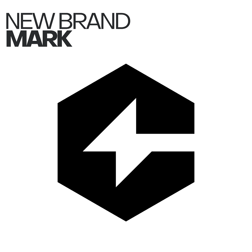
2025 Brand Mark
Our new branding brings together the best of what came before. Professional, dynamic, and symbolic. It embodies what it means to be a Catalyst, and provides a versatile identity that carries our mission and vision forward.
At the heart of our 2025 Brand Mark lies its defining shape: the hexagon. The hexagon represents the strong, intentional community we build, chosen because it is one of the strongest shapes in nature. Like a beehive, each side connects to the others, creating a structure that holds and lifts. It’s a picture of belonging that isn’t just an idea but a lived reality.
The lightning bolt represents the spark that ignites when a young person is seen, supported, and given a chance, landing their first internship, connecting with a mentor, discovering their voice. Together, they capture the “Catalyst effect”: individual transformation grounded in community, multiplying into lasting change that ripples outward.
This refreshed branding brings together our name, visuals, logos, and colors into a stronger, more complete reflection of our mission and vision: empowering young people and creating opportunities that last.
Youth Voices Leading the Way
The refresh came from the ground up, with our Communications interns leading the way. They analyzed our old website, critiqued our messaging, and imagined how our brand could speak with more clarity to both the youth, and the donors.
Intern-Led Brand Identity Development

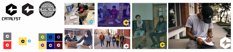
The screenshots you see here celebrate the creativity and hard work of our interns. From analyzing and critiquing our old website to redesigning visuals and sharpening Catalyst’s message, these images showcase the process behind the refresh and the leadership our youth brought to every step.
Each student took away something unique from their experience. One intern shared how online sessions deepened their understanding of marketing and the essentials of branding. Building on that, another reflected on teamwork, explaining that redesigning the website showed them just how important communication and collaboration are in any job. Adding to these perspectives, a third talked about messaging, describing how they strengthened Catalyst’s voice by making it more persuasive and aligned with the organization’s mission.
This project was more than a brand refresh. It was a chance for young leaders to put their skills into action and leave a lasting mark on Catalyst. Their creativity, insight, and collaboration reshaped how we show up to the world and reminded us of a truth we hold close: leadership is shared, and youth voices matter. By entrusting young people with this work, we are living our credo alongside them. We are proud of the voices behind this effort and grateful for the future they are helping to build.
What’s New
We’ve carried forward everything that makes Catalyst who we are while adding fresh ways to share our mission. Here’s how the refresh shows up.
Website Refresh → A clearer, more welcoming space that removes barriers and connects people to resources.
Visual Identity → Fresh colors and design elements that reflect belonging, safety, and community.
Stronger Messaging → Language that carries our mission forward and reflects the lived experiences of Oakland youth.
Mission Rewritten → A renewed statement of purpose that speaks with clarity, vision, and the voices of the community we serve.
Logo Expression → Using our logo more clearly and confidently to better reflect who we are.
Explore the Refreshed Catalyst
Change is never just about colors or logos. It is about telling our story in a way that reflects who we are and who we are becoming.
We invite you to keep exploring what’s new. Look through the updated pages, see how our story continues to unfold, and discover the many ways you can stand with Oakland’s youth. Together, we’ll keep building belonging, removing barriers, and changing futures.


Comments